Project: TORRID Mobile App Redesign
My Roles: UI·UX Design, Prototyping
Duration: February 2024 - March 2024
Team: Kate Chang
Project Overview
Torrid, positioned as the fastest-growing retailer in the fashion industry,
continually confronts the challenge of upgrading their platforms to meet the
increasing demands of its expanding clientele. However, amidst rapid growth, the
company has inadvertently focused solely on the basic functionalities of its
mobile app, neglecting the opportunity to create a more refined and
sophisticated mobile app that not only reflects its brand identity but also
secures a more loyal customer base.
In February 2024, I spearheaded the redesign of Torrid’s mobile app aiming to
enhance its accessibility, focus, and creative curation.
The Approach
To avoid executing an aimless redesign, I continually revisited the purpose
behind this revamp while also conducting thorough competitor research to
pinpoint areas where our app could improve. With no significant negative
feedback concerning usability and user flow in our current app, I made the
deliberate choice to leave these aspects unchanged, instead focusing on
enhancing visual elements. Any necessary alterations were approached with
caution, kept small and iterative to minimize potential resistance of users.
The Objective
“How can we refine and elevate our mobile app to offer customers a more enjoyable and accessible shopping platform?”
Problems With The App
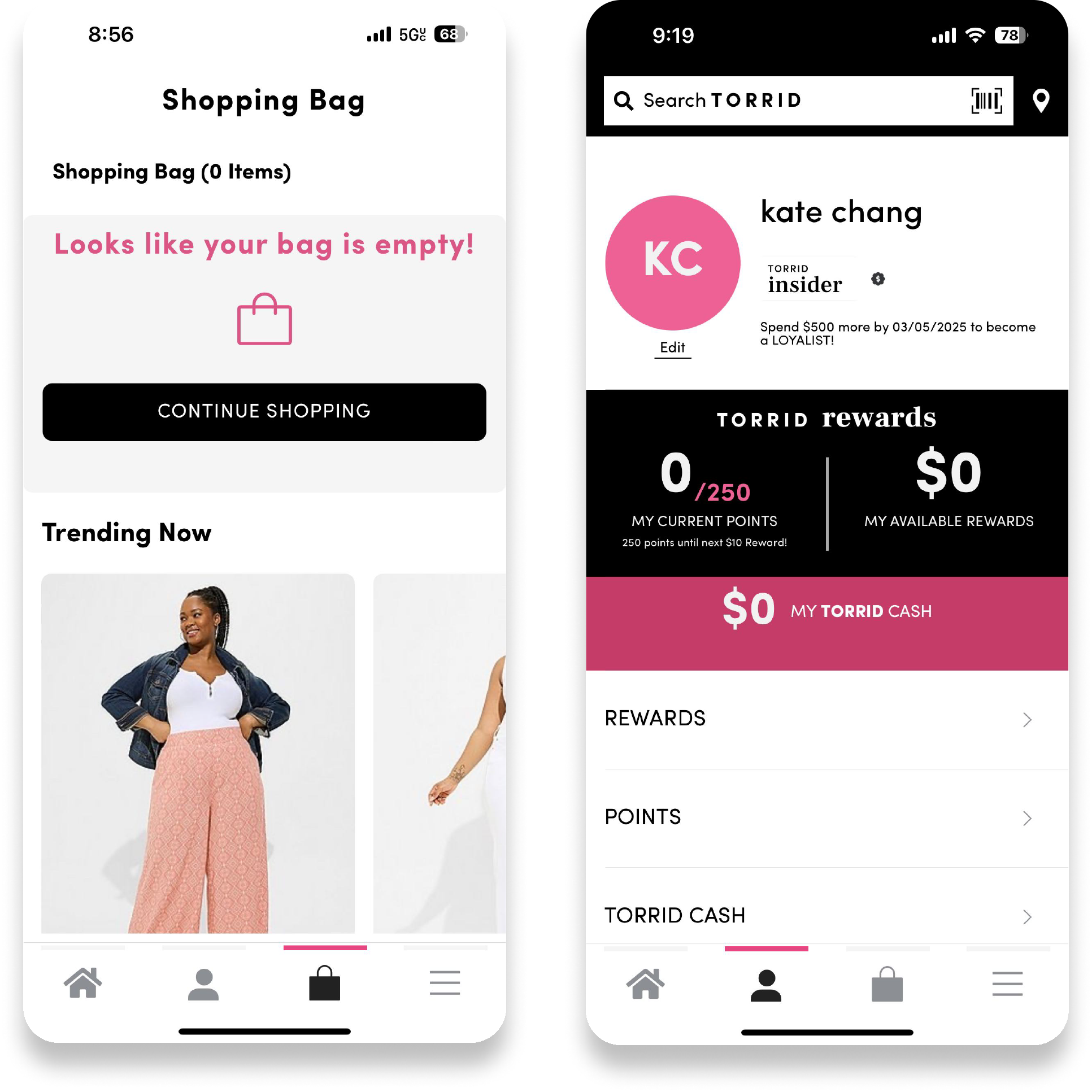
1. Fulfilling Basic Functionality Without Personality
Torrid is renowned for its celebration of diversity and
advocacy for body positivity, aiming to ensure that every
woman feels welcomed and appreciated regardless of her
body type or size. Despite such empowering brand identity,
the app design remains exceedingly minimal and basic,
detracting from the overall perceived quality of our brand.
With larger retailers now introducing their own plus-size
lines, simply meeting basic customer needs will not suffice
to exceed or even maintain our current position.
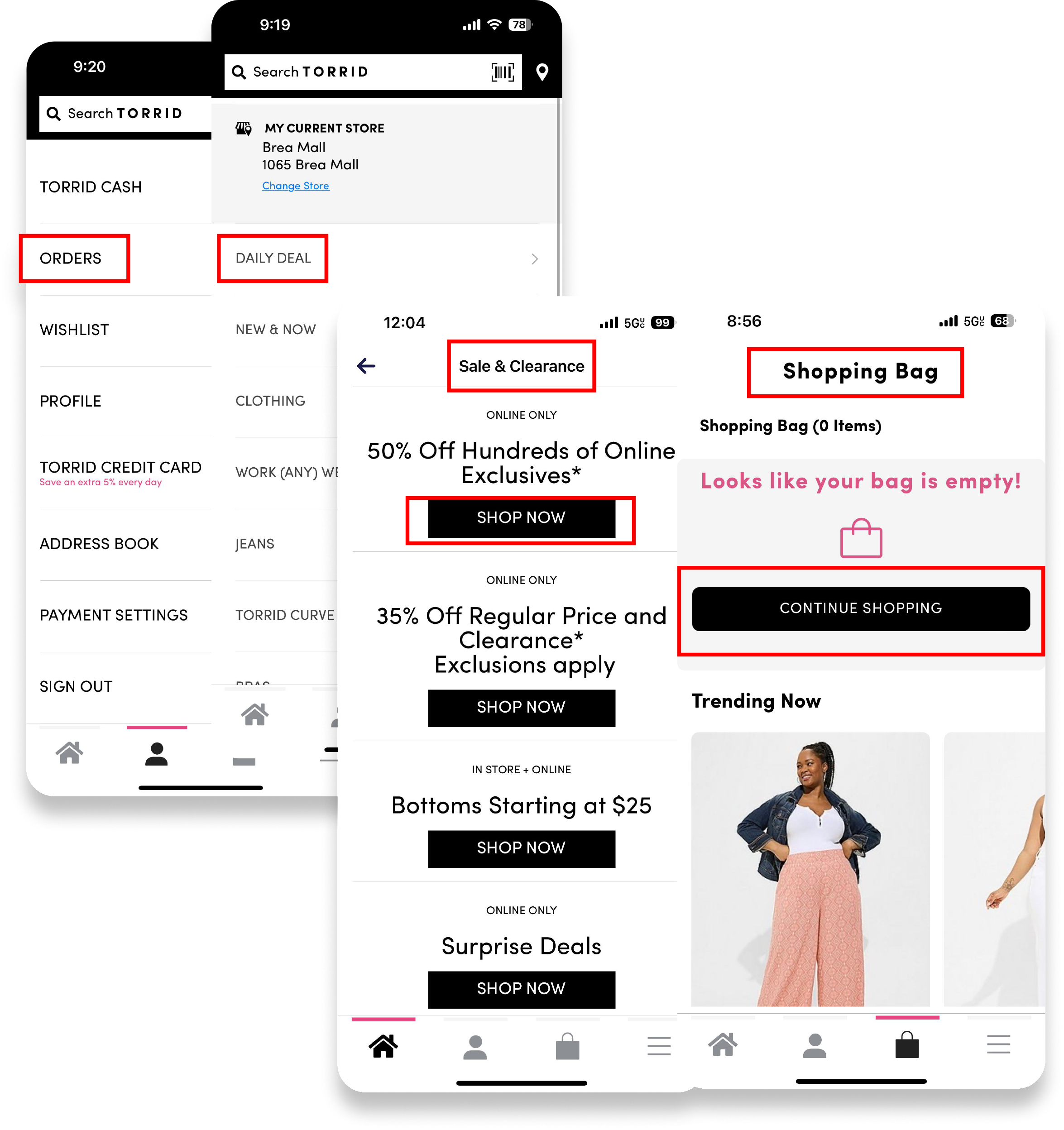
2. Fragmented Experiences
Torrid's mobile app lacks consistency in its UI design, leading
to a feeling of unpredictability and unreliability among
customers. This inconsistency increases the likelihood of
customers forming a negative perception of the app and
the company, as they may interpret it as unprofessionalor
indicative of poor quality.
Solution
1. Breathable & Engaging Visual Design
Keeping in mind that our priority is to create an interface
that helps customers accomplish their task in the most
seamless way possible, we focused on implementing
engaging imagery and icons to help convey information.
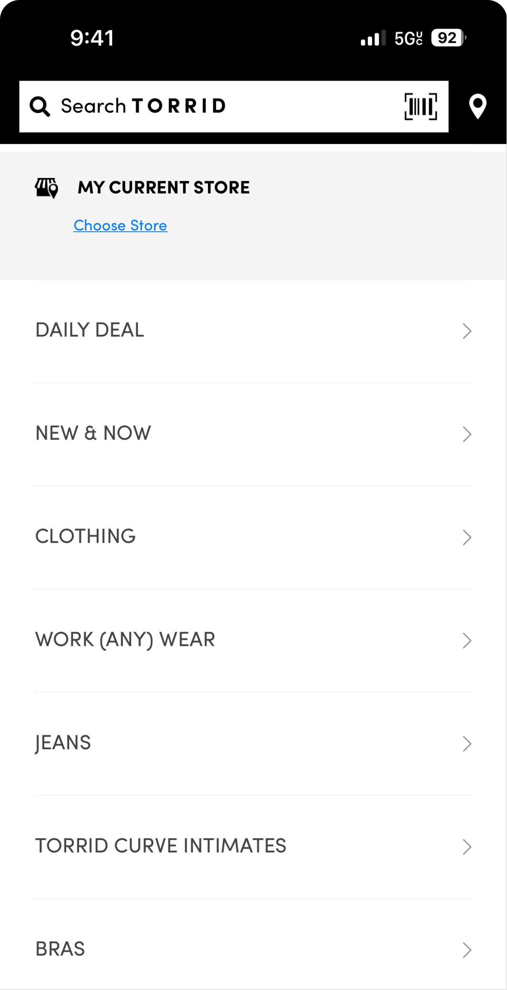
OLD

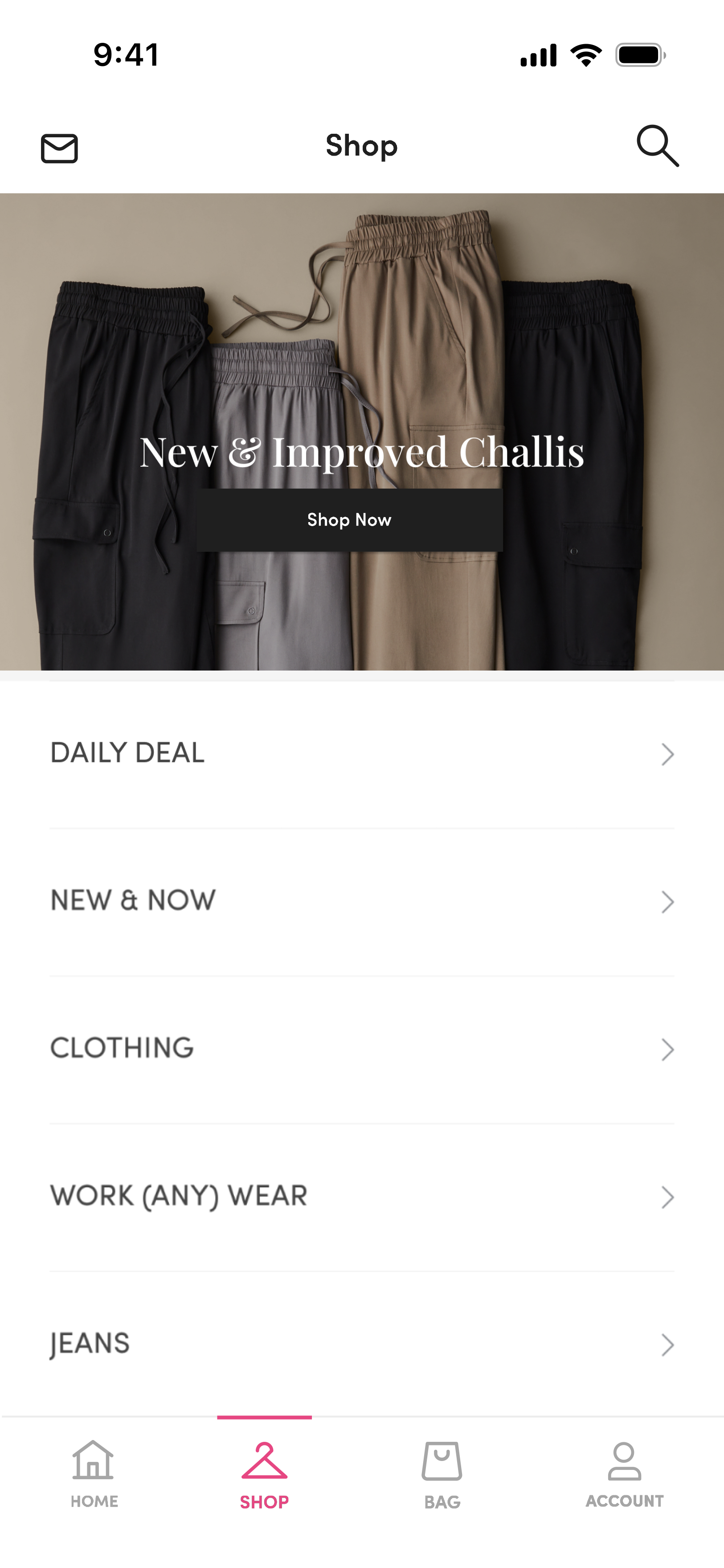
NEW

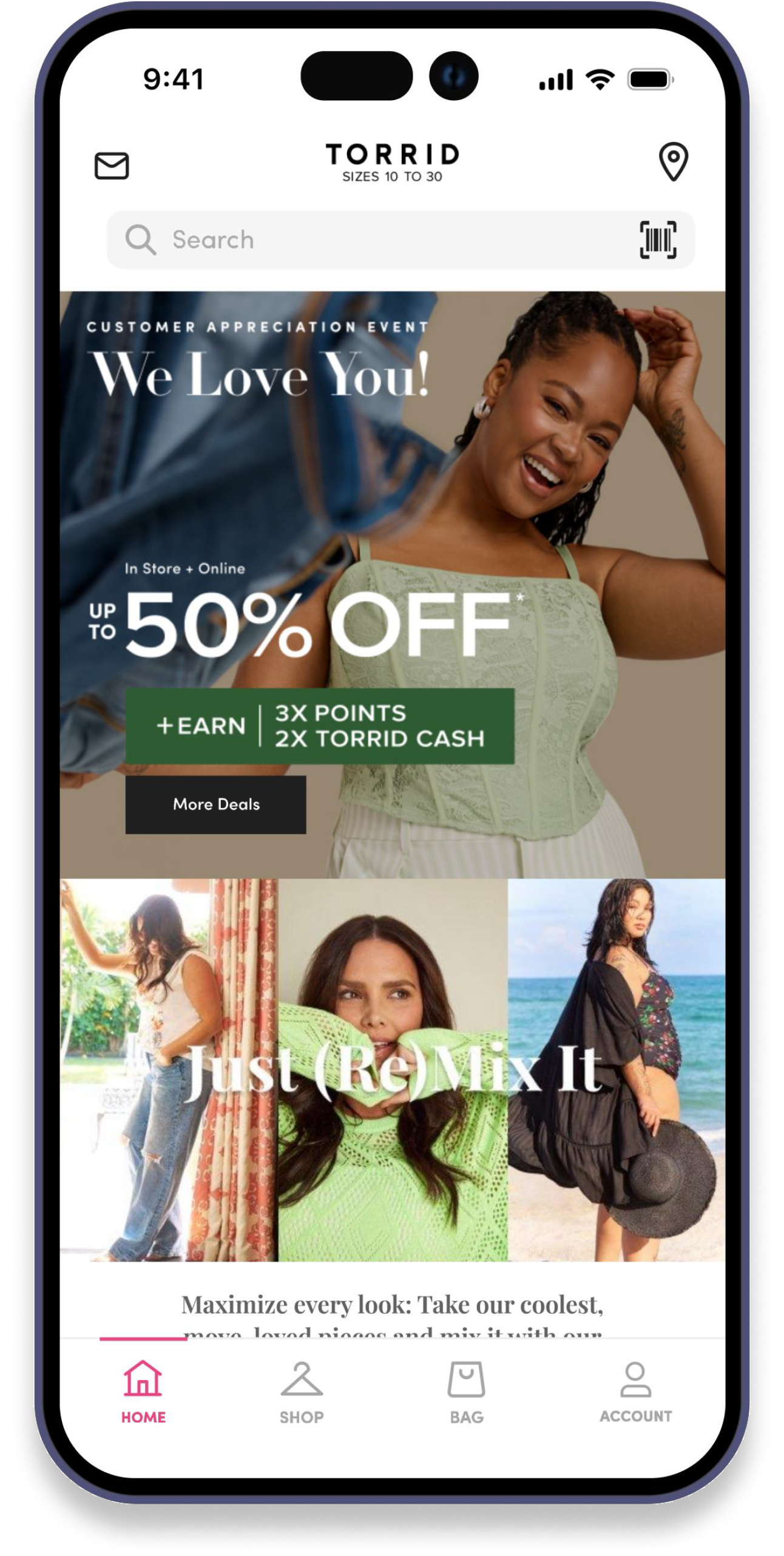
To achieve a more streamlined appearance
and effective information architecture, the
Torrid logo is now fixed at the top, with the
search box positioned directly underneath.
Additionally, icons for the inbox and store
location are aligned with the header.


To enhance the clarity and usability of the
app's interface, icon designs have been
redesigned to include accompanying text.
Incorporating an engaging image at the top
of the page ensures that customers remain
captivated throughout their experience.
The image was carefully chosen to resonate
with our brand's core value of body
positivity. Adjustments to text size,
placement, and color were made to
enhance the overall aesthetic of the app.
Information hierarchy is improved to align
on aesthetics and user flow.
2. Subtle Color Adjustment = Significant Visual Impact
The subtle adjustment of toning down the stark black color
transformed the app's appearance from outdated to
sophisticated. While users may not notice the change
directly, it significantly enhances the overall aesthetic of the
app.
OLD

#000000
NEW
#1F1F1F
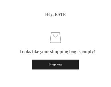
3. Reinforce Consistency
We prioritized consistency to enhance user satisfaction and
improve learnability by employing uniform button sizes, text
styles, and icon strokes.
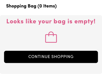
OLD


Box edges and font sizes were not
consistent throughout the pages
NEW


Usability Testing
Our main objective for this project was to ensure that customers could
seamlessly transition to the revamped app without needing to readjust their
habits. The only significant change to the user flow, apart from visual design
updates, was the switch in placement of the account and shop icons.
We prioritized testing this change during usability testing to determine its
necessity.
During testing, users completed various tasks to simulate the intended user
flow. None of them has noticed the switch in icon placement. This suggested
that users, based on their experience with other apps, are accustomed to
seeing account icons placed at the end of the navigation bar.
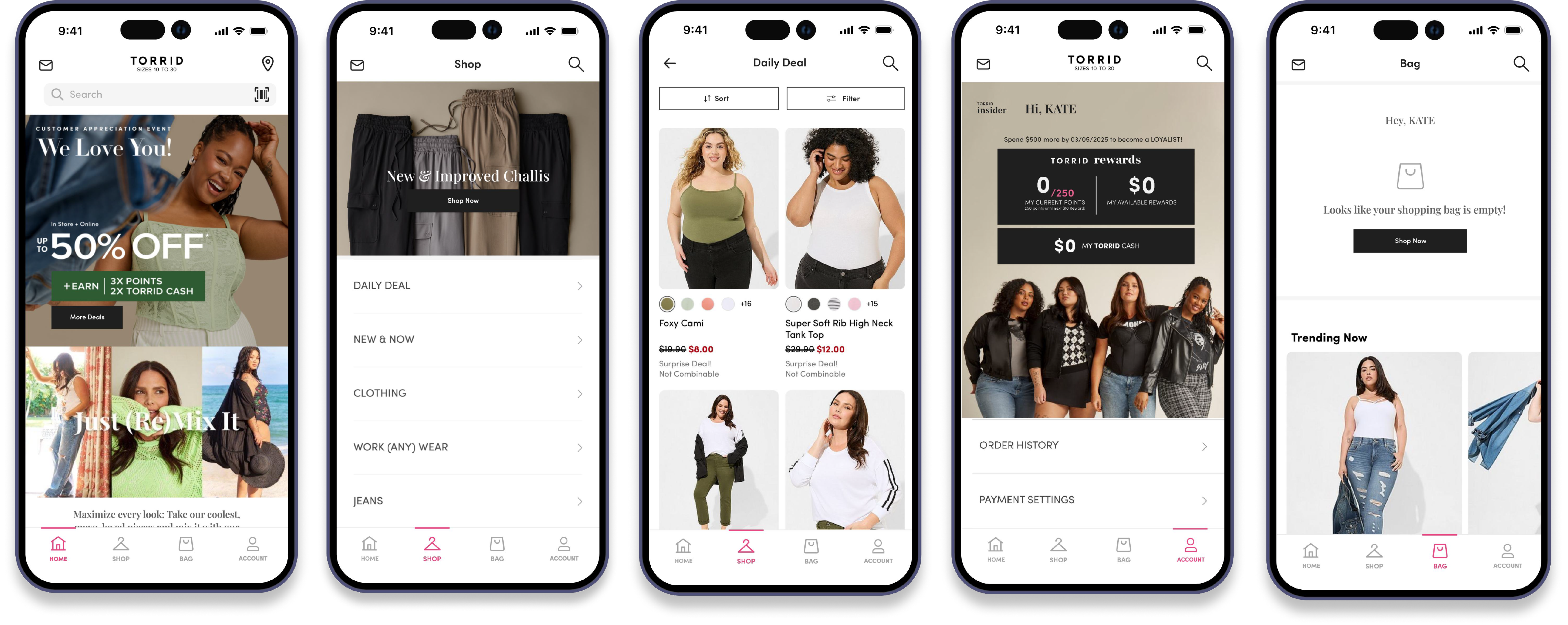
Final Look
...
Takeaway
The user-testing results underscored the importance of thorough usability
testing in validating design decisions. Despite the subtle change in icon
placement, users' familiarity with conventional navigation patterns was
evident, emphasizing the significance of aligning with user expectations for a
seamless user experience.
The successful integration of subtle visual adjustments highlights the impact
of meticulous attention to detail in enhancing the overall aesthetic and
usability of the app. By carefully balancing visual elements such as color,
typography, and iconography, the redesign not only elevates the brand's
identity but also improves user engagement and satisfaction.